Search the Community
Showing results for tags 'art'.
-
So I finally decided to make an art thread to show off some of my art. I am a self taught artist who likes to draw lots of Fan Art as well as my OC's in stories that I have been writing. Feedback is welcome and encouraged. If anyone ever wants to post my art anywhere, feel free to do so as long as you credit me. Please send me a PM or message me on here to let me know that you're doing so. I do both digital and traditional art, though traditional art posted, will probably not all be scanned due to lack of a functional scanner. Feel free to request things, but there is a chance I might not do the request. Without further ado, my art! Oboro Lapis Lazuli Cana Alberona Nohrian Festival Leo Celica Profile I might add more later but five seems like a good number to start with.
-
I've decided to post some works that I've created for Fire Emblem. Here they are: Scarlet (first drawing/2016) Chrom Lucina MLP crossover fanart Scarlet (second drawing/2017) Here's a link to my art gallery on Deviantart if you'd like to check out more: MetalAmethyst


-
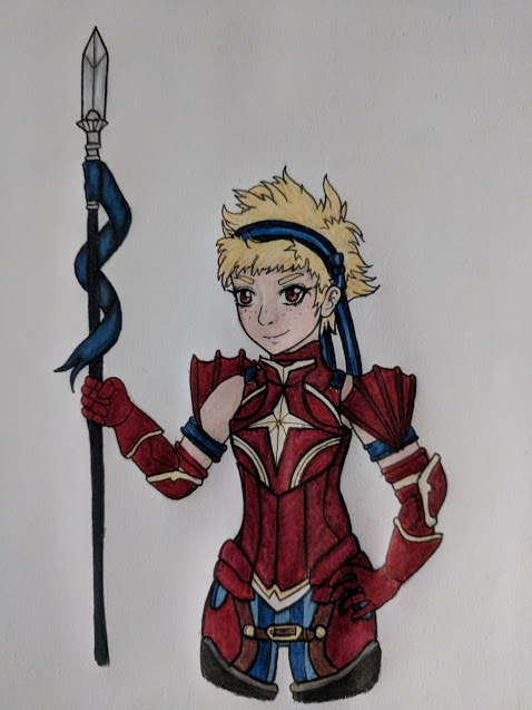
I'm a shy muffin and want to get better about posting art and getting critique! All feedback is very very appreciated! I have a somewhat rarely-updated deviantArt here: dA linkeroo ; though I mostly take commissions off a dragon-collection/breeding website called Flight Rising (ooooh boy, the obsession runs deep but that's an entirely different beast LOL I even made a fan-dragon for Chrom). Here's my latest, a sketch of Lon'qu. I'm been pretty sad/anxious and unmotivated to draw so I did this today to try and psych myself up! Still trying to get the hang of coloring in SAI ver2. Everything after this one was done in SAI 1. A commission I did for someone of their character: Sketch of my OC Kantor ❤️ ❤️ My OC Idunn 😄 Another commission:
-
Hi, I thought I may as well open up an art thread. I'm not sure how often I'm going to post here, but for those who want more regular updates can check out my Tumblr: http://sie-tje.tumblr.com/. My finished works are also on DeviantArt: http://sie-tje.deviantart.com/. I'm open for commission work and you can find info on that on my Tumblr and Deviantart. So for this thread I'll start off with my most recent piece that I finished today. I'm open for any kind of critique, so don't be afraid of telling me what's on your mind. First up are the sketches for the pose and for getting a feel for the character. You get extra points if you can guess which character it is at this stage. Next up is the digital sketch, line art and flat colors. And here's the final piece.
-
Hey guys, Does anyone have the special edition art books and is able to make scans? I am very interested in seeing the designs for the armour and any characters - particularly Iago if available.
-
This is about making the Nyx Mini Sculpture, that little entry for Misc Scribbles. I don't have a DevianArt account or anything like that, so I ran it by Tangerine to post here, who turns out wants to liven up this subforum a little bit, so I guess everything works out. Eye candy first: I began by picking a scale. It is important to keep in mind that Nyx has stunted growth, so whatever scale is decided upon, she will still be even smaller than usual. I used the proportions from this tutorial as the template. In a photo editor, I lined up the front and side proportions. Then I made multiple sizes of them, printing out a whole bunch, to get a sense of scale in real life. After consideration, I have opted for the sculpture to be 1.75 inches tall. A sculpture of her at 1.75 inches would make her just about 5 feet 1 inch tall in 1:35 scale, a common military model scale, and a reasonable life-size height for Nyx. The game itself is inconsistent with exact heights anyway. After settling on a pose, I then loosely followed this guy's method of making a small scale armature. Some changes were made to accomodate Nyx's smaller size. I stripped the plastic from the wire because the limbs with the plastic would have been too thick. I also only followed the wire steps, none of the other steps involving the cardboard and glue. Nyx is too small for me to bother with those steps. I timestamped the first step just in case I needed to prove I began within the contest time frame. The sculpture will be made primarily with Fimo clay. I chose polymer clay over epoxy because I did not want to be limited by any curing time. Polymer clay pretty much stays malleable until you bake it. I chose Fimo because it has a lower bake temperature than Sculpey, to minimize the chance of melting any extra material I may decide to add later on. The workstand thingy is just some pair of random nylon picture wall hangers being held together by a screw and some wingnuts. Most Nylon seem to have a higher melting point than the baking temperature of the Fimo, according to their MSDS, so I figured it's fine (and turns out it was fine.) One problem with polymer clay is that it adheres poorly to wire. Watching this guy on YouTube, apparently you need a layer of Green Stuff (it's a two part epoxy clay) in between. Basically, the wire provides good surface for the Green Stuff to stick, and then the Green Stuff provides a good surface for the polymer clay to stick. I followed that YouTube guy pretty extensively in the making of this sculpture, but I have to be extra careful to apply as thin a layer of Green Stuff as possible because my armature is made of twin wires. On the other hand the uneven surfaces of the twin wires were enough to make the Green Stuff stick, so I did not need to roughen the surfaces with a file. Green Stuff sticks to everything when it is initially mixed, including tools. I applied a thin layer of mineral oil (baby oil) on the tools and my disposable gloves, although people online usually use their own spit and bare hands. That's kind of gross, and I already had mineral oil and gloves anyway, so I went ahead and used them. The Green Stuff is so sticky that this is as thinly as I could have applied it. Before it hardens, I spread a thin layer of Fimo on the Green Stuff just like the tutorials teach. Then the bulking up begins. It will never be visible when finished, but adding individual major muscles helped me keep track of which places require more bulk. People like to avoid focusing on one area too much because it might make that area disproportionate with the rest of the sculpture. I pretty much ignored that practice to focus on the legs to make sure they aren't lopsided. I used some cheap drug store dental tools as sculpting tools, and dipped them in mineral oil so that any clay would be more prone to stick to the sculpture. After the legs are done, I moved my focus upward until the torso was done too. Then the arms were next. Individual fingers were rolled and stuck to the back of the hand. At this point I have accidentally bumped and deformed the legs a few times already, so after fixing them again I decided to bake the sculpture to harden the clay... ...which led to tragedy. The sculpture was bumped again and this time a thumb and finger snapped off. Attaching them proved difficult, there was not enough area for the clay to properly glue them back on. They look real flimsy and there was no way they would even survive posing a book on them. Plus the whole thing just plain looked bad. I decided to break them off and use Green Stuff to make finger placeholders. Green Stuff can be flexible after drying if you mix less hardener. This way they will bend first unless they were bumped too hard, and even then they were only placeholders. Also, the face and nose were sculpted. Finishing the basic sculpting was done relatively quickly, and the fingers were then removed and replaced with Liquid Green Stuff. It is a completely different product, not a clay. It is a goop that dries into a hard solid. It can be applied by paint brush. Here I formed the fingers using Liquid Green Stuff by touching a goop onto the hand using a paint brush, then slowly pulling away to form a finger. The Liquid Green Stuff also works as a gap filler, I thinned it with water and brushed it onto the sculpture to fill any unwanted gaps between the clay (which are all baked now) that have been there until now. It will dry rough, but that is not a problem because I was going to sand the sculpture's unwanted bumps smooth anyway. The colored sheets in the background are the Testor sand papers I was going to use. It is easy to see where the Liquid Green Stuff filled any gaps. I also used some to add some bulk in the back. Some fingers on the other hand broke off too, but at this point I didn't really need placeholder fingers anymore, so I just remade them directly. The next thing I moved on to was the cape. It is not made of paper, these are just templates. I found a random lid with a close enough curvature and traced it. Tamiya masking tape was used to hold the cape templates to the sculpture, to see how it would look. I will post more of the progress later, this post is getting long.
-
Hi everyone! I just a new member here and this is my first post. About 2 weeks ago I want to create my version of Fire emblem (Game of throne inspiration). However, I think that it going to be bad because I don’t have any skill in art. So I design to practice myself something easier. Over the past 2 weeks, I made some sprites from Sengoku rance. Some of them look good but some are not. I will continue post my work here. Like I said, I very new for this and I need you gays to suggest me. Please, Please teach me how to do better. Yamaoto Natori Kanami Rance Sill Uesugi Kenshin A regular samurai warrior Nogiku Yuzuhara Yusumi Akashi Kazemaru Rizna Shisuka Some failed works
-
Just going to be sharing some of my doodles here, they were all done using Art Academy on the 3ds. Also don't expect any Awakening or Fates stuff, I wasn't all that fond of those games. Here's a few to start with: Sylvia. Julius/Ishtar w/ lyrics to Dalbello's "Black on Black" Eldigan (profile-view) Lute (this one was actually a request from a while back)


-
So uh...I ended up taking the plunge to make this thread, to share what creativity I end up drawing/painting and the like. ;) I mostly work with traditional mediums when I draw/paint but I also do digital work, sometimes on my phone a poor womans excuse for a Cintiq and I strive to improve. Atm, I'm working on getting more used to working in digital and perspective, colour is as ever, a learning subject (there's so much to experiment with after all). Well, that's the gist of this thread basically. So uh, since I'm not savvy with words (and if I'm left unchecked I'll just end up rambling nonsense) I think I'll let my art speak for itself..? Yes that sounds like a plan - onward then! For starters I'll leave this piece here: (As I make something new/or if I find an older piece to share, I'll update this post to showcase it - oler updates will get categorised under spoilers)
-
So something I've been wanting to do for a while is make a full set of profiles for my ideal Fire Emblem class tree. Each one is a set of class uniforms (both male and female for each class) followed by class bases, max weapon ranks, weaknesses and promotions (if applicable), and Skills. The Skill system I thought of works like this: Each class has 1-2 Class Skills and a single Learnable Skill. Class Skills are, as you would imagine, tied to the class and are not retained when reclassing, except when the old and new classes have a Skill or two in common. For example, if a Swordmaster reclasses into, say, a Sage, his/her Class Skills would change from Pursuit and Critical +10 to Focus and Miracle. The Learnable Skill, on the other hand, is obtained when the unit reaches a certain Level (usually 10) and always carries over between classes. For example, given the above scenario, if the Swordmaster had Astra when reclassing, then he/she would keep that Skill, unlike the fixed Class Skills.
-
Hey everyone! I'm kinda new to this forum (but I've been playing Fire Emblem for a few years) so I figured I'd make a gallery of all the FE related art I've drawn! This thread will be an eternal WIP ;p (oh and here is my commission info, in case anyone wants it!)


-
So yeah, before you laugh, I just gotta say that it turned out A BIT better than I imagined. The app I used was fairly basic, but got the job started at least. I did not even bother with shading and all that fancy stuff yet I'm honestly a bit proud of myself! I dabbled with using unity to make basic games and could not make a basic pixel dude to save my skin. At least I can semi make faces. xD I'm totally going to be doing mote. I easily see myself being great at this if I practice. :D

-
I have several more scattered about that i'll look into once i can find time! i mostly do fanart for stress relief, and i'll admit to finding the 3ds title's designs the most fun to draw despite some of the armor's craziness :p i have some awakening stuff around too somewhere that ill upload once i find it and once finals clear up i'm hoping to update with more new stuff but for now this is what i got to share. (ignore the low effort look of the lines LOL)


.thumb.jpg.7050c1aec2dfda01b6531aac6b9a6b16.jpg)
.thumb.jpg.e32e940046ec1d2eafa2bf6a98d857a0.jpg)

-
Uh. Was bored so I decided to draw FE 14's lackluster villain. I used what I could make out from the hidden truth's DLC portrait and model of Anankos, plus using his kid, Corrin to fill in the gaps.

-
I have 45 frames of a Pegasus Knight animation that I have been working on. The problem is each of the frames now thinks it has 32 colors instead of 16; however, the colors are exactly the same. Basically I have two "white" colors representing two areas of the sprite. Even though they are the same color, Usenti thinks they are different. Does anyone know if there is a way to merge color swatches in Usenti or any other art tool? I am thinking it will be very timely to go through every sprite and combine the colors pixel by pixel.
-
As people who have seen my art thread know, I'm not exactly the best artist, but I still try to have an eye for art. The first is Ephraim in his "Methinks he dost protest too much" pic It's hard to describe, but his armor and body are ultra shaded a detailed, whereas his head is more flat and basic. It looks fine by itself, but in conjunction with his body, the juxtapositioning is jarring. Next Ogma His arm's muscles seem lumpy and unnatural for some reason. Lastly, bug-eyed Eliwood. Maybe if this style was more common in the game, it wouldn't stick out as much, but since Eliwood only seems to be the one who has crazy eyes, he clashes with the other characters. Anybody else find any art that just looks a bit off or agree or disagree with my pics?
-
Hello! Welcome to my topic for my art, specifically character designs from an old ROM hack idea, as well as any other main series Fire Emblem art, should I decide to post any. Enjoy! (To see more art, as well see updates about projects, leave character suggestions, and attend occasional live streams, follow my art blog here: http://keldeart.tumblr.com/ ) Fire Emblem X Pokemon Main Series Fire Emblem Other Art


-
So here I am, finally making an art thread. For the most part, I'm hoping to amass constructive criticism and hopefully strengthen my art style along the way! Before we get to the actual art, I apologize in advance for any low quality images, 99% of the pictures for the traditional art are taken with my phone. [spoiler=Old stuff] It sucks that I don't actually have the actual image for this next one but whatever, right? All that stuff is maybe a year or two old at this point and my art style has changed since then so none of it is really 100% relevant anymore. I could use more stuff for that last spoiler but it's not really necessary because I'm here to talk about more current pieces. [spoiler=More current art, Cutesy things]Okay so this is all going to be my more cartoony chibi stuff, which is for whatever reason the stuff I color most. Over the summer I drew up a boat load of mermaid designs that i sometimes still draw so yeah! The original drawing of this particular mermaid will be further down in the post. Edea Lee from Bravely Default Meduka Pitty Pat And to finish off this little chunk, have a little Agatha I drew for a friend. And now for my most preferred style, the not-chibi one. [spoiler=How Many Ways Can I Draw Myself Before You Get Suspicious]I'll might as well start with this one Up next we have random OC Anglerfish Mermaid Maybe I'll color that someday. Different OC that ended up as practice drawing butts. I'm never finishing this. And, to finish off this spoiler, something I drew yesterday! Because this is a Fire Emblem Forum, the obligatory Fire Emblem art! [spoiler=I'm hoping to expand to other FE characters but I've been lazy as of late so it's mostly Awakening characters right now]Lets do this! Henrizzle the Birb Wizzle Tiki The Actual Five Year Old MU, because why not? Ryouma from FE14! That all barely scratches the surface (especially the Fire Emblem Portion, my god), but I think it's a relatively good mix of my range of art styles and a good place to start. I hope to be posting mainly Fire Emblem related works, because we all can relate to Fire Emblem for the most part, right? Comments and criticism are welcomed and encouraged!
-
Hello there everyone! it has been a long time since I step foot on this site. Anyways as the topic says who here can draw? And it does not have to be perfect either just decent enough. The reason why? Well I am making an odd request and not everyone will want to do so but some people do have this done get some assistance. Whoever says yes or is willing to do this for me we can discuss it in greater detail just send me a PM message up here and then guess can go from there. Anyhow lately I have been creating OC`s (Original Characters) and you see I can`t draw not one bit to save my life and yes I have practiced and practiced for years and still cannot grasp it for anyone who may say to just do them myself heh me+drawing do not mix. So I was wondering if anyone would like to be something of an artist for me from time to time I am not asking for a lot and you will not be drawing frequent just here and there very rarely. A friend of mine already drew one of my characters for me (which I will show in a picture at the end of this post) But my friend does not really do art requests and she only did it for just that 1 time. I have all character details listed down for each character. I do have 1 requirement though the character must be draw anime/manga style so if anyone knows how to draw anime/manga even if just a tiny bit that would be great. Also of course all drawing would be credited to whoever drew it like for example when my friend drew my character Yume she signed her name on it and blah blah you get it right? So yeah just that decent but not perfect drawing because I am not a picky nor bossy person you do whatever your abilities bring you and I really have not much say as I am not the one drawing it and able to draw manga/anime atleast a tiny bit that is all now I`ll leave you guys with a picture of one of my characters. And I know I said it already but again my requests will be spread apart as I am not looking for a lot I could request a drawing now and not ask for another until like 3 months later. I just really wanna see some of my OC`s completely brought to life seeing Yume just how I imagined her was amazing,and trust me if I could draw remotely myself I would do them all alone but sometimes ya gotta ask for assistance.

-
 by NICKTofficial Please visit the FEU topic to download the .xcf file What You'll Need: GIMP, graphics program. Title. Script-Fu scripts. (Outer glow, stroke, drop shadow) Appropriate font. Let's get started: First of all, in your GIMP program create a new image with HD dimensions, 1920x1080. The bigger the original image the better, you can downscale and tweak but upscaling will generally look terrible. Font: Now, select a creative and appropriate font and write out your title using the text tool, font isn't super important, but it helps convey a feel and style, Fire Emblem for example has a very Medieval, empire aesthetic to their font because it fits with the style of the games. I went with Cinzel Decorative to reflect the angelic and light nature of this mock-project, I chose 200 as my font size for the previously stated reason, it allows a large, crisp text that will work better with our later effects. I recommend starting with a white base as we're adding colour later and it's always easier to do things later than to try and do something now and make it harder for ourselves to do things down the line. NOTE: Before making any visual edits to your text, make sure that you are pleased with the kerning. Kerning is the space between each letter, you can increase or decrease that space in the following box in the text popup window. The reason you want to do this before editing is because any edits you make to the text layer will render it as a visual layer and remove the text-tool element, meaning any later changes you want to make in regards to font and kerning will require excessive reworking. TIP: Don't be afraid to try out different things with your font, go all capital, all lower case. Camel case is good if you want a compact title of multiple words or like the effect, you can also increase or decrease the size of each individual letter. You can also change the height of a letter so that it shifts on the line, giving you an un-even look to your title. I don't recommend mixing fonts. Now that you've got your text and are happy with it as a base, crop your workspace so that you're not dealing with a lot of deadzone. NOTE: These screencaps were made before kerning, hence the prior note. From here on the title you will be seeing has had it's kerning edited. Drop Shadow: My first move with any title or text is to add drop shadow, this allows it to stand out and pop against any background and gives it at least a basic amount of readability, which is essential especially if you choose to forgo any strokes and/or borders. Stroke: After the drop shadow you need to think forward a little in regards to what you want your final result to be, will it have a dark border? Light edging? I personally prefer the white thin stroke line because of the way it works with the other effects we'll be doing, so that's what I'm doing here. I did it at a 75 position this time, but you can go 0 if you're worried about having thick text or outside if you want a cleaner inside. I also chose white but if you're going for a more border look you can choose black. At the moment, if you started with the same colour as your stroke you won't notice any difference and that's fine, this is all prep for the future. Now, this is going forward a bit again, but with the envisioning the end result if you're not going to be using textured letters then I'd definitely recommend this shadow gradient effect unless you're desiring flat text, like the Final Fantasy logo. See Here Shadow Gradient: Adding a shadow gradient will allow our text to pop just a bit more and will begin to show benefits of adding that stroke layer earlier. Before adding the gradient to your image, make sure to put it in a new layer. Now that you have that new layer, right click on your font layer and select "alpha to selection", this will select the image according to transparency, making it so we've only selected your letters. Now when you add a gradient to your new layer it'll only be in place of the letters. Because it's on a new layer I chose the "FG to Transparent" option which will add only a shadow to the lower layers. If your base colour isn't white then this will allow you to still add a shadow unlike using the FG to SG option which will require more working. Don't worry if it's not right on your first try, keep going until you get what you're after. Be mindful to erase your last step (ctrl+z) before redoing the gradient. Colouring (Layer): Here is where we'll be adding colour to our title. At the moment the colour doesn't matter because we can change that at a later date. Make a new layer and name it "colour" and set the layer mode to "Color". This will transfer only the colour value to the lower layers. Now fill this layer with any flat, saturated colour. Now, I'm assuming that most of you don't want a red title, so let's open up GIMP's handy colorize tool. Make sure you have your colour layer selected and then move the top two sliders around respectively until you get your desired colour. For LIGHT MEDAL I decided to go with a nice yellow. NOTE: If you've followed this tutorial point for point then understand that the colour of your colour layer might not be 100% what you're after. Because of our gradient and the color mode the colour our title will appear to be is relatively different, so make sure that you're happy with your text's result and not the layer's colour. TIP/NOTE: If you aren't wanting textured text and want a solid colour, then repeat the earlier action of selecting to alpha our text layer and filling in a new layer with your colour or desired gradient. You can also try out the different layer modes with the colour layer and see if one of them give you your desired results. Don't be afraid to experiment. example 1 | example 2 If you do want textured font then keep following, if you aren't and are happy with following the last TIP/NOTE, then skip the texture segment. Texturing: Adding a texture to your title can reduce it's blandness and give it feeling and character. Depending on your project's theme or style can influence your choices here. For LIGHT MEDAL I just went into google and searched for "Light Texture" because I didn't have anything in mind, however for example if your project was called "Water Crest" then you could use a water texture on your title. example For LIGHT MEDAL I went with this texture: click here Here is another chance for you to try different layer modes to get different results. I liked the look of Hard Light as my layer mode. NOTE: Make sure your layers are in the right order so that no effects are hidden or wasted. NOTE: If you're having trouble with things like a layer being coloured when you don't want it to be, but can't move it out of your layer order without it disrupting everything, try using the alpha to selection tool on that layer and deleting the selection out of the colour layer. Highlight: Now that our layer has been textured, or if you skipped the last step, here is where I added a high light. If you're happy with your result you can also skip this part but I felt I wanted to combat the shadow a little and felt it fit thematically. Using the same steps as our previous gradient shadow step, I selected my font using alpha to selection and made a new layer, however instead of the previous gradient settings I went with bilinear so that the highlight would appear in the middle of my text with fadeouts on the bottom and top. I also changed the colour from black to white to match. Outerglow: For our last and final step, we're going to be adding an outerglow to the title. This like the drop shadow just help gives it readability. When I apply an outerglow it's generally the same colour as what is in the colour layer. TIP: Don't be afraid to experiment with your title. Save often and make sure to erase any errors before redoing effects. Try out things like lens and gradient flares, inner glow or blurs. Final Result: To give it a more JRPG feel I added the title in Katakana in smaller font, added a stroke and drop shadow to it. Our colour layer added a gold touch to it automatically. Closing: If you have any questions, post them below or contact me on the FEU discord, through PM or through email at NICKTofficial@hotmail.com. Thank you very much for following along and following are some titles and texts made whilst following the basic principles seen in this tutorial:
 -
-
Hey all, (hope this kind of thread isn't against the rules...) I've been looking around but can't seem to find these anywhere, I'm looking for vector art (or just high quality) images of the emblems from the countries of Hoshido/Nohr/Valla. If this isn't clear, I mean something like this: clicky That would be the Hoshidan emblem. Though obviously that image is pretty small and has an overlay, but it's on the right track. I would love it if someone could create renders of these! I also realize that there are some pieces out there are that are pretty close to my request like this, but I'm looking for the non-italicized version of the emblems. Thanks in advance!
-
Hey everyone. This is my first post here and I don't even know if this is where I'm supposed to put this lol. Just wanted to share a drawing I did on Nintendo's social media (?) forum thing, Miiverse. It's basically where you can talk about games and make scribbles. Hope ya like it! By the way, if you want to see it on the Miiverse website, go to my Miiverse page - https://miiverse.nintendo.net/posts/AYQHAAABAAAtVHhqp_AghQ Thanks :)

-
Here's a doodle that I did. It took me a while, and it isn't my best, but I hope you like it. It's of Lucina, Shulk and Stocke being BFFs. :)


.jpg.d50ef977446ee931c1b558cea11eba38.jpg)
.jpg.09c421a955ee3ffb320647d23a3cb9ca.jpg)


