

Cymbeline
-
Posts
568 -
Joined
-
Last visited
Content Type
Profiles
Forums
Events
Posts posted by Cymbeline
-
-
I think the last one looks really nice.
-
Is this better? Or worse?

It looks better to me.
-
About how many pixels would you say it needs to be shifted?
Personally. . . I think something like this. . . the red line:
Your mileage may vary though! ^^;
-
XD don't know what to do with this guy, but I had fun making him. I borrowed his head from my splice from the contest a while back with Ephraim Joshua and Ephidel (basically the top of Ephraim's head filling in the gaps left where Joshua's hat used to be, I just really liked how that looked XD)

Tried to add some shading around the hair, hope it doesn't suck too badly XD
Oh and seriously the previous splice in the post above looks like it needs something... and I don't know what any suggestions?
His left shoulder is too large. Move it to the right a bit. Also, there are two different (FE7 and FE8) brown skin shades around his nose. It looks like you're using FE7 colors, so change the FE8 shades to FE7.
It looks like a pretty clean splice to me, and I like his design and colors as well. :) Keep up the good work!
-
LOOK AT ALL OF THIS DUST.

Armor knight man.
His head is not in angle with the body. His head is also too small for the armor, and the shading on the skin around his bangs needs to be fixed. I think a change of armor would be best.

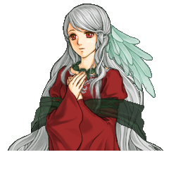
FC has been worked on and improved (?????)
It's improved, but there are still problems. Such as her right (our left) eye being tilted (the bottom part of her eye is angled). . . when her right eye isn't. Her right (our left) breast also looks off, but she could maybe have a large chest. Anyway, here are a few other problems I noticed:
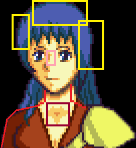
Yellow boxes: Hair shading needs to be fixed. Referencing some FE mugs will help.
Wine(ish) box: Shading is awkward around the neck and collarbone.
Pink box: Nose is wrong. I'm not sure if you're going for a front view or if her head is turned. . . So, if front view: fix the bottom part of the nose and reference FE6 Anna's mug to see how the nose should be at that angle. If it's a side view, you might want to reference Lyn's semi-forward gaze mug but also fix the eye to show that it is a (somewhat) side view.
Red lines: Where I think the neck and the shoulder should be (your mileage may vary. . . probably).

And a quick update on my persona. This better?
Better. However, the shading around the bangs needs to be fixed and also where the neck meets the collar.
-
So you made that Chester mug (I love it, by the way). XD Very nice mugs, especially the shopkeepers (and Chester). "Anna" looks cute as well. Also, your mugs look very clean to me!
-
Did you look at the other one? XD
What other one?
Though, in general, you really will want to reference other mugs alongside yours (side by side). From what I can see, the shading and anatomy isn't good, so comparing them to FE mugs will help, though how much it does differ is based on your abilities. As you said, sticking to splicing for now is probably for the best. However, if you do want to continue that full custom now, do it side by side to other (FE) mugs based on how you plan to do your mug (face angle, clothes, skin, etc). That will help a bit, but truthfully it doesn't mean it'll come out good.
-
I'm back after a bit and I have my first FC done (Hide your children)

[spoiler=Normal Sized]

Have at it.
I'll bite. . .
She lacks whites in her eyes. The base of her neck looks too thick. Her shoulders are uneven. . . Hair needs shading in the middle rather than wholy on the sides.
Um. . . hope that helps.
-
I like Palatino Linotype more, but both are nice. ^^
-
"No way!!! That'd be horrible!!!"
-
Oh god, I always forget eyebrows. Will fix. Please check in in about 10 minutes.
EDIT: Ok so more like a few hours.

I redid the hair. Suggestions on how to fix?
The hair should be a bit thicker or less flat, in my opinion.
As for the other two: Amewan is nice, though the hand seems maybe a bit too small. Also, there needs to be some shading under her shoulder armor.
For your persona, the collar needs more shading to define between the skin and collar.
-

This is for my hack, and this is one of NeimixColm's children. If you're going to critise, come back 10 minutes after you do so. I feel guilty 'bout these double post's you know
EDIT: BESIDES the Top-right of the hair (OPV), feel free to critise. I just caught that.
I can't tell if that is the hairline or bangs. However, assuming it is the hairline, it needs to be raised higher so that she has more of a forehead. Also, the armor on her shoulder looks too large so making it smaller would be good. On the right side of her right eye (our right), there is a blue dot next to the hair, but on the skin.. Lastly, the biggest problem to me is that she looks like she lacks eyebrows. I'm not sure if that's her design or not, though. . . so. . . yeah.
-

Tell me what you think. XD
I like the design of this one. However, this sprite has the problem of two different outline shades: most of the sprite has FE8's (which is darker) while the hair and headband have FE7's (lighter). Fix the FE7 outline to be the same color as the FE8 shade (since you seem to be using FE8 colors). Above the headband there seem to be green dots above a red line. Make them dark red. Other those two, I noticed a few other problems:
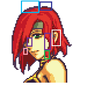
Purple boxes: Need shading in these areas.
White box: The ear is a different set of skin shades (FE7) from the rest of the skin (which is FE8 skin tones).
Pink box: Looks like two sets of outlines here. Get rid of the bottom dots.
Pale blue box: Purple shades in the hair against the outline. Fix it to be the darkest hair shade.
Dark blue box: outline seems a bit odd in this area for the head. Make it straight and connected to the line to the left.
Green box: The chunk of hair here looks a bit odd.
-
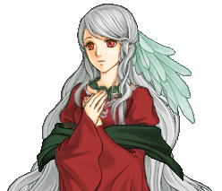
I took into account what you said, Cymbeline and this is the result and a new Dorothy.

There are still at least two different outline colors. But that should be an easy fix. Also, there are also two different skin color sets, and the problem with the ear still being too close to the eye.
As for the second one, there needs to be a little bit more shading under the necklace. The bow on her head is a little out of perspective, as the left side of it should be smaller than the right given the way her head is turned. However, I think it's actually rather cleanly spliced, so you are improving.
-
Sure go ahead.
Okay. First the one that doesn't need a reference, basically the colors. Stick to FE7 or 8 colors because mixing them together can create an unattractive result. The outline around the head is FE8's outline. If you go with that outline, make the rest of the colors FE8 (which includes changing the skin color as well). Also, there needs to be some more shading under the headband. Anyway, the rest of the stuff isn't as simple for me to point out. Here is a very large(!) picture for easy reference (I'll use the one on the right since the difference between the two seems to be only skintones):
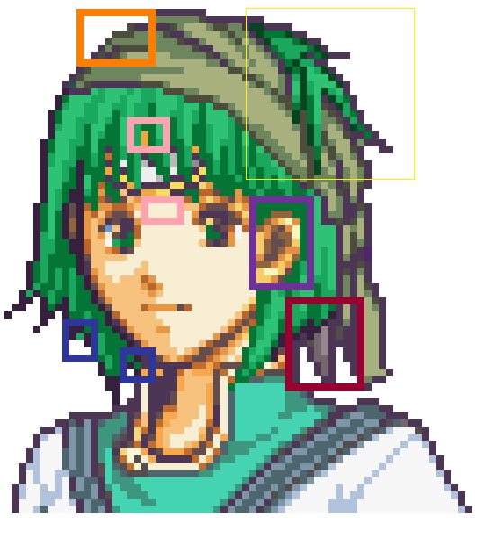
Red box: Fir's ponytail is visible. Erase all of it.
Orange box: Missing an outline.
Blue box: Small green dots outside of the lines.
Purple box: Ears are a different color from the rest of the skin (make sure to stick to one). It is also too close to the eye, so move it to the right a bit.
Pink boxes: Small shading fixes.
Yellow box: A very dark green color here that is not present in the rest of the hair.
Of course this is only what I noticed. . . so there may be some other things I missed. Hope it helps at least a little bit.
Also, not sure if you know about the easy way to recolor or not is. Here is a link to a video tutorial another member of SF made since I have a hard time explaining it: http://serenesforest.net/forums/index.php?showtopic=23568
-

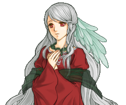
Which is better?
The right skin tone is better. Not sure if you had planned on fixing it or not, but the rest of the outline on the clothes and the body is lighter than that around the head. I can give some more critique if you want.
-
I'm not sure if the deadline hit yet or not (Is it by Midnight today?) If not, here is my entry.
-
Oh, cause the hair is coming closer to herself around that region? Yeah that'd be cool, but idk if I can find cloaks/capes long enough. I could possibly try lengthen it but I usually have trouble with that. I'll check if I can come up with something!
Cause I've only tried messing around with lengthening about 2 times or so and it was hard for me to do that while trying to keep it looking "natural".
I think all you really need to do is cut a bit of the hair off and redraw it back in to follow the cloak. . . I'm not sure how difficult that will be. Depends on whether you want the cloak to be loose or tight. . .
Here is a quick edit to illustrate what I mean (done quickly, so don't mind if it's kinda junky looking):
Hopefully that helps a bit.
-
I'm using FE8 colors. Pent's new hair color is more in the range of FE8's saturation level but it also uses the darker purple outline. If you want more examples look at Natasha. Blonde hair and white clothing strike hard against the dark outline.
Oh, who did you get the colors from? For whatever reason, the hair shading seems really light (in contrast to each shade.) :/ That might just be me though.
Edit-- Natasha's mug also has the third shade of her cloack (fourth for her hair) as being dark rather than light. The third shade in yours is a little bit light, but I guess that can all boil down to personal preference.
-
EDIT: ^ Oh... well.... changed the clothes a bit =D
Well..... I'm not entirely certain which I prefer, now, but how about I can just show both.
Opaque
Transparent
EDIT: Oops, forgot something I had to edit...
EDIT EDIT: Got it
EDIT EDIT EDIT: *thinks she forgot something else*
 I need to pull myself together =D
I like the transparent one. I think the cloak should go around her hair though, and that you should edit the hair so it looks tied down along with the cloak. Hope that helps.
-
I like the Nephenee picture! I think the hat is well done.
And the Reed Brothers' Bagels thing is funny too. XD
-
I think his hair needs to be a little darker (since the outline seems to be really dark against it), but I do think he's cute. ^^
-
Christmas themed sprite!!! =D I wanna do a male x-mas themed sprite now, but anyway... I really like how this turned out. =] Thoughts?
Just wanted to say that I like the colors. ^^ They're really nice.
To add on, though, I think it would be nice if she had a different hairstyle or clothes. =o Though I'm not sure what kind.
-
Joshua- Astelaine. I really like his design.
Leila- "A loser." At first I couldn't tell how many changes were made, but comparing it to Leila's original mug they are quite subtle. Nicely done.
As for the battle sprites, I voted Ecut for both. I really like the palettes used.
Free shall start a spriting topic
in Sprites
Posted
There's a. . . transparent pixel on his chest (at least I think so, since I pasted it on Paint and it along with the background went black).
In any case, there are only a few things I think should be fixed: the shading around and on his right eyebrow, as well as the shadow under/next to his hair to the left of his right eye. Some of the skin next to shirt shading looks too light, but perhaps that is just me. Anyhow, hope this helps (and I like his design).