

Ump
-
Posts
46 -
Joined
-
Last visited
Content Type
Profiles
Forums
Events
Posts posted by Ump
-
-
These are great. That dog is awesome. I like how you improved Nikolai. I think if you lightened up the second/third purple shades a bit, he'd be perfect.
-
Sprite sheet looks sweet so far, keep working!
-
Head just looks skinny to me. Nice stuff.
-
It's a logo for a hip-hop culture and entertainment group.
-
Hey guys. I've been working on this logo lately on Gimp (which is rather frustrating for me), and I'm looking for some suggestions to make it better. I'm going for a simple look.

-
Well I started out doing full customs and only did a few splices and edits. I eventually learned tricks and got better from criticism, looking at sprites and pictures zoomed in, and just learning from old mistakes.
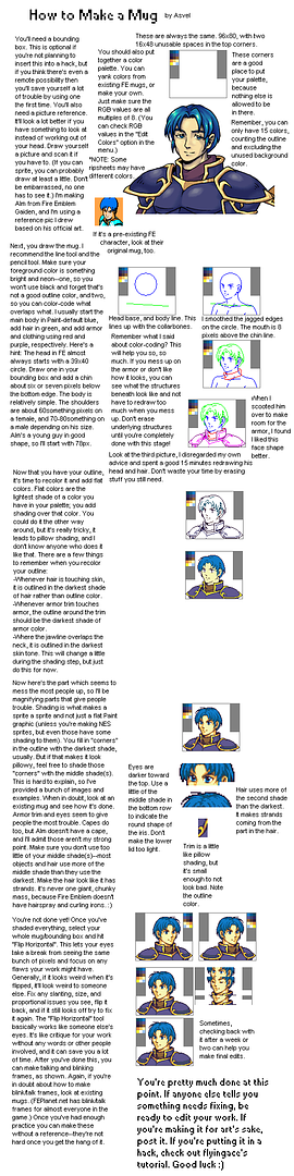
One trick I learned that I think would be helpful to you is comparing your outline to existing mugs. In paint, you can select the background as your second color, then set your selection as transparent so you can drag your outline over other mugs with similar poses to get proportions and stuff right.
Another thing is trying your best not to pillow shade. Even if you don't shade properly, try your best not to pillow shade, because you'll eventually figure out what works, but if you keep pillow shading you'll get it wrong every time. When I started out, I used Asvel's tutorials. This isn't the exact one I used, but hopefully it can help you the same. http://img.photobucket.com/albums/v218/cardelocke/mug_spriting.png
As a sidenote, you generally want to avoid using the outline color on anything but the chin, eyebrows (with darker skin colors so that it blends well), and just a few pixels at the top of the eye.
-
Nice! I love how ya'll did the braids.
-
How suspenseful..
lol @ Agro
-
These are nice, that 3rd one (in the white armor) looks particularly cool to me. I can't wait to see what they look like finished.
-
Nah I haven't made a sheet in years lol.
-


*lobs
-

Much better. Thanks Aeo
-
This is all great stuff, from the sketches to the coloring to the animations. You're great with your craft.
-
The end of that synths instrumental is gorgeous
-
Aye I never thought of that, I'll probably ref that on the open/blank parts, but I was referring trying to have like a bumpy/patchy aspect to the hair.
-
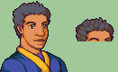
Lil update. I want the hair to look something like this, but can't figure it out:
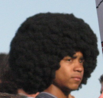
except not as perfectly combed out and all that. Hard to find exactly what I'm talking about, but I'm sure ya'll get it.
-
^The ruthlessness lol, but check out this link
http://fc06.deviantart.net/fs70/f/2011/310/e/8/furc_port_tips__pillow_shading_by_nekkers-d4fd1aw.png.
-
Inkredible *echoes
-
This is pretty good. I like overall design and look of the character.
As far as CnC I'd just have the shoulders just go straight out and down instead of doing that little angle curve that they have (I guess to define the shape of the jacket). Also the mouth seems to be angled too far sideways. The shading is a little off on the jacket as well.
-
I watch UFC fights all the time. I totally forgot about that Machida fight, wish I saw it.
As a side note, Silva deserved that knockout for playing with all his opponents like that.
-
Hunter X Hunter and Hajime no Ippo Rising.
-
Try to round out her jaw. It REALLY helps to have existing FE mugs on your worksheet to compare to. I never make a mug without them.
-

WIP-ish. Kinda. Trying to figure out what I wanna do with the hair. Rehash of this.
my very first mug.
-
I either didn't get enough sleep had transportation issues.
Dat Merc
in Sprites
Posted
Shoot. I'll say I'm in love. Your stuff has been inspiring me. I wanna sprite so bad, but I just don't have the time. Good stuff, man.