

Siuloir
-
Posts
799 -
Joined
-
Last visited
Content Type
Profiles
Forums
Events
Posts posted by Siuloir
-
-
The p[art where the tiny piece of cloak falls behind her legs looks really awkward, and falls at differing rates across the piece.
-
Oh, thanks guys! ^^ I hadn't made a battle sprite in a long time either, so I'm glad I'm not rusty there!
Yeah, the horse's armor was really tricky, those ridges, errg. xP
The gorget/throat guard on the horse is my favorite part. Reminds me of cataphracts.
I'm inclined to agree with Loki - This is your best battle sprite. (
Though it's not 16 colors, cheater). -
@Ana - I think it may be you. They're showing up for me.
@Errant - Thanks, appreciated! My fault for not adhering to the format.
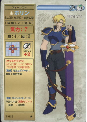
Also, it occurs to me that Holyn wears a virtually identical outfit to Gourry of Slayers fame. Oh, 80s-early 90s anime designs.
-
Aww I wanted to do Seth :p
Looks good, though! I wasn't up to FCing a horse anyway
Anyway have Echidna (full custom)


Screw spriting horses, seriously. Doubly so if they need animation afterward.
But damn, Echidna hit the gym. I really like the look of the axe, as well.
Anyway, here's Holyn. FC'd. Could have been more adventurous.

[spoiler=TCG Art]
-
There's always way to counter FoW. Torches, thief vision, slow advances with durable units, etc. You still know the entire lay of the land, as well.
Give me more Thracia Fog of War.
-
It just doesn't need incentives. I mean, unless you're offering like an actual fucking prize (see: money, physical good, etc.), then there's really no other incentive other than "I'm interested" and "that seems fun;" and let's just fucking face it - that's really all the fucking excuse we need to do a thing.
We're artists. We don't need a reason. We just fucking do it.
This.
Plus, I feel the existing competitions (though different subject matters) lay a pretty good basework - Most people I feel will know what to expect, and for those who are new to the competitions forum in general, it is undeniably best to keep instructions as simple and straightforward as possible.
-
I just requantize in Usenti or GraphicsGale; Ain't nobody got time for playing hide and seek with stray pixels, as the kids say.
You can also make your 16 color palette at the beginning of a sprite to save you a little trouble. Or just pull the palette of what you're splicing and replace as necessary.
-
Yeah - I think the stickman requirement might be a deterrent to some.
-
It'd be nice to see more animations, but they generally require a far greater time commitment.
-
And I honestly feel that your jaw fix was wrong. Like said before, it's really down to opinion on that matter.
It's really not a matter of opinion, though. The second jaw (Nih's) is stonier, and less rounded/babyfaced. He looks more anime in your original incarnation, even.
-
He looks a couple years older in Nih's sprite. Early-mid 20ish.
I dragged the lower part of his nose down a pixel and liked that a bit for making him look sterner, but YMMV.
-
The face on your edit looks good, but I don't think it fits this character. He looks like he's a manly dude that's trying to be bishie. And Leyon isn't bishie. xP You even made the jaw less masculine.
She fixed his eyes though - They look like he's wearing makeup right now. :P
Nih's also has a better proportioned jaw with regards to his neck and the armor, IMO.
-
Okay, I decided to update this guy real quick before moving onto a new project. I like him a lot and he was the only one of the three main characters of my FE story that didn't yet have an updated mug and he'll be in the next set of six anyway, so yeah. :P

His name is Leyon, and yes, he's also the red cavalier knight of this tale. But get this, he's a prepromoted Axe Paladin while the green cavalier knight starts at the tier one Axe Knight class. I decided to stray a bit from the usual red/green knight tradition. There are still two unpromoted cavalier knights that appear in the beginning, but one wears purple armor instead of red. We also have yet to see any unpromoted axe cavalier knights not named Kieran, so I thought I'd make my green cavalier knight one. ^^
But anyway, the main reason I love Leyon is his cupid shenanigans. lol Yes, he literally does try to set his fellow knights up on dates. And he's the general too, so he partnered up anybody he wanted! XD
He was never interested in finding love himself though, until he met a certain red-headed mercenary girl who is the lord of this tale. Heh heh.
I think this is arguably one of your best works, in terms of cleanliness and execution. The trim on the corner of the near shoulder could be touched up, and some of the hair as Errant said, but overall nice job.
Also, doesn't that just make him Titania in red? ;) (Or RD Kieran, though Oscar is 2nd tier as well then). Sorry, just being contrary.
-
I still don't think he's being lowered far enough, especially since he bends his knee completely to the ground. He'd be lowered considerably. It's also because the other leg doesn't move much at all.
 There's no way he could bend his right leg that much while his left left still stands pretty much straight.
Agreed, his stance needs to go deeper - It'd be much less bracing otherwise.
-
Except I did change him, look closer.
And sorry, but I'm not going to work on these sprites anymore. So I recommend that you leave them alone too.
You reverted his hair back to the original, and you changed his neck shading, which doesn't actually fix the way it's structured. You simply made a superficial change.
Ana, while your shading has improved, you seem to be really recalcitrant and actively fighting against receiving CnC and feedback, to the detriment of artistic development.
-
Your shading definitely improved!
The collar of Morris' armor is much wider on the near side. Also, he still definitely is very Oswin - It's not only the color, but the similar trim design and the Armorknight pauldrons. I'd have used a different color, personally.
Skye's forehead also looks rather large.
-
Why don't you marry him and live off his tenacity?
Perhaps becausetTenacity is not a directly exchangeable currency with which to pay one's food and electric bills.
-
Can't you use that one FEditor version on FEU that can dump scripts? (Not cam's thing)
I haven't tested it though, do the script dumps from that work fully?
Is Pi's Magic Feditor now on FEU?
If all else fails, Cam's script dumper works pretty well.
-
People hate on the Great Knight, but are okay with the three frame attack choppiness of the base cavalier?
Generals win for me, followed closely by Great Knight, and then Warrior or Nomad Trooper.
-
you can make FE5 on the GBA engine
why not get a head start?
hell why stop there? you just hack the FE5 ROM and change what you don't like
You really, really, do not understand the disparity between 'amount of effort required to execute upon a project' and 'available time/resources/interest and reward'.
Anyway, if you all are serious about rewriting the dialogue, the original Japanese script can be found here: http://www.pegasusknight.com/mb/fe5/st_index.html
I redid up to 15 or so at one point.
-
Dewey needs more development. 100-to-1.
Stay tuned for the next chapter, in which Dewey rap battles a dinosaur.
-
Awesome to see a recording - I'm in the same boat as you in enjoying seeing how people go about drawing (it's also a great teaching tool, IMO, with regards to spriting). More spriters should do this.
The overall armor design is nice, and the trim is well executed! I think there's too much variance in the shades you used - The RGB values are close to triple what the normal distance is between shades in FE. His hair suffers a similar problem, and it muddies up the details considerably.
-
I like how Katt is just a Rogue animation edit, and Millia is a sprite theft.
-
Yeah, I think it really says something about FE7if when it can be compared to Corrupt Theocracy. I mean, it looks like the leveling curve is going to SLAM 20/20 once the main game actually starts. Also...
DAT BOSS HP
Don't you know, big numbers automatically make a game good!
Fire Emblem: Inheritance of Ash (Trailer Released!)
in Fan Projects
Posted
IoA has a trailer now, pending its imminent release!
All credit to GhastStation for the creation of the trailer - I simply chose the music. )
https://www.youtube.com/watch?v=UimhNR0vYTQ