

Vampire Elf
-
Posts
343 -
Joined
-
Last visited
Content Type
Profiles
Forums
Events
Posts posted by Vampire Elf
-
-
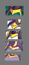
I might go through and cnc Holyn at some point but just on a side note:
1) fe4a is basically dead
2)
 < that's the fe4a current Holyn... By Blackavar
 -
My shading on the super shiny wyvern guy I think she meant... I agree it's icky, but I needed more AA on this one too :)
-
What's the matter, Vamp? don't tell me you're losin' it, now.
That diviner definitely looks dropped down below your level of skill. The shading
one the armor looks inconsistent, and your "shiny" shading effect isn't going as
well as I've seen it before, like on....
I hardly think I'm losing it, haha, I specifically wanted the sharp crispness that aliasing provides, I have however fixed this into a smoother sheen.
 this, mmhm.
It's especially problematic on DAT close collar.
I see that his body should be tilted, but his close shoulder still looks too short
compared to our left. Well, the neck looks like it was placed too much to our right,
and he's branded as god's generic mistake.
Still tweaking parts of the trim and the shirt shading though. But I think I've sorted(for the most part, I still might fix it a bit more) The angle issue.
And just so everyone knows which class this is :D
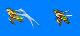
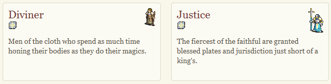 Yeti's battlesprites for them, and the class description, from Immortal Sword site, http://www.bwdyeti.com/fe7x/
 -
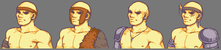
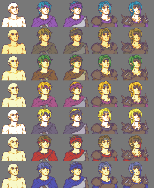
Thief/Rogue Generic Portrait
1 - 2 - 3 - 4
weak - mid - norm - strong/subboss
I had to change the Ilian palette because purple is their secondary colour and theif/rogue only use hair colour, primary colour(the colour of their cloaks) and tertiary(the greys and taupes of the shirts of the first 2)
Also added a necklace to 1 and 2 and a neck tattoo to 3 and 4 as though the neck was shaded properly, it came across as boring, added a scar to 4 to signify the eyepatch more and just generally tweaked their hairs, slimed the line of 2's chest so as to make him less bulky looking in that area.
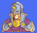
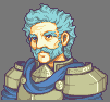
Diviner/Justice Generic Portrait
4
strong/subboss
Removed the coif, added a helm back, tidied and tweaked everything else, including but not limited to re-aligning his spikes and their plates, re-sizing and moving his collar, adding cheek-plates to the helm, re-shading his robe, the robe is the main thing I'm iffy about now.
Also revised the pallete for the Justice and decided against using hair colours for the undershirt and spikes, so instead I'm using the countries secondary colours(which for the most part are pretty similar to the hair anyway haha)
-
I can go through and cnc it if you'd like, but I just want to make sure that I'm not spending my time pointlessly editing, outlining and writing paragraphs if it isn't going to be used.
To be direly honest, I think that with that final product, you'd be causing more harm than good, I know you're already pissy with me(for a reason I can hardly fathom), but I feel this is something that you have to hear, so I'm not going to step on egg shells and I'm just going to come out and say it.
That hair... might look good to you, but it isn't anything like what fire emblem hair should look like, even for a more ribboned and noodely style of fire emblem hair it has many technical flaws. I'm being extremely blunt here because I find it annoying to see these sorts of tutorials go out to people who don't know any better(i.e. Newbies), try not to take this personally as I'm not doing it to annoy you, as I said above I'd be happy to cnc it, as I'm sure many other people would be too, just give us the thumbs up/down so we know whether we'll be wasting our time or not.
I'll give you a brief outline of what I might go into if I do cnc it.
I think you should revise the hair shading and try to get it:
1) as technically flawless as possible
2) closer to fire emblem style, though if you would rather not do this then a small annotation conveying that it isn't quite the fire emblem style, would work fine.
3) palette revision, the contrasts seem a bit off to me, though this might just be the rough shading.
Finally, while I do admit that it is a massive improvement from what it was before, and I completely understand the time and effort put into this, I just think that the bit extra necessary to have it get past that stage would make it one of the most useful tutorials out, it just needs to get to that point first.
p.s. I hope you can understand that I'm not trolling, trying to be malicious, trying to put you down and act arrogant etc, this is just something I felt should be said and as I stated above I'm sure that the extra work in this tutorial will pay off very well.
p.p.s. Sprited Nickt's hair is improved, and it makes more sense, though I think that the amount of outline colour in the "rear" spikes is very dramatic for a non-black hair colour, maybe fill them with the darkest brown so as to not have them stick out so much like sore thumbs.
-
Ermm why does he have hawk's eyebrow and Johan/Johalva? 2 eyebrows on 1 eye... :| The hair shading is also very very messy and the headbands angle doesn't match the heads.
TBH I don't really like it, It looks very rushed and seems to lack finesse, effort and therefore skill too.
-
Just a quick note to say that I've also thrown this in ALS's topic incase he wants to go through and do any of the listed suggestions.

Eyes/brows, the lines on the brow were more there for humour, but I really do think Lakche needs to look determined, she isn't a laid back girl from what I understand so you should try to convey that.
Collar, I don't think it should slope in toward the top like that, if it was soft material then maybe it would, but how you've sprited it, it looks very thick and stiff, so you either need the material to fall more smoothly and shade it as if it were thinner and softer, or change the angle so that it looks nicer for stiff material, this is just IMO.
For the thick band of trim, i think it would look nicer if it was a consistent slope, particularly when using diagonal lines consistency is nice, e.g. diagonal in 2 pixels, 2 pixels, 2 pixels, or a pure 45* angle of all 1 pixel diagonals.
e.g.

Or if not then you want the anti aliasing to be impeccable
e.g.

While you can't really anti alias outlines onto the background, you can do it on things inside the image, like the trim on the chest ;)
Here are a few examples of how the games, and other spriters have done similar trim.
Gilliam
My Lakche
Aeo's Ayra
Blackavar/Chalpy's Radney
Squarerootofpi's Radney
Referencing Gilliams and taking a look at how the others are shaded might help, I particularly like the edged highlight line on the far side that Pi and I implemented, it adds a crispness to the sprite.
A few more examples, this time for the detailed swirl in the trim,
 , referencing these might help it come across more nicely.
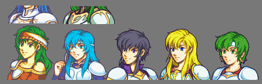
Above are some examples of white armor shading, I just find that it looks very stark in your Lakche mug, you're welcome to ref any of my mugs if you like, I just think that for 4 shades, you could have it look a lot more smooth and crisp (yes, both at the same time :P, crisp lines, smoothed with anti aliasing)
Anyway that's about it for now :), I know a lot of the changes weren't done by you, but I thought I'd throw it in here incase you wanted to take a quick look and maybe have a go at editing it if the cnc's helpful at all ;)
-
Just a quick note to say that I've also thrown this in Lumi's topic incase she wants to go through and do any of the listed suggestions.
Eyes/brows, the lines on the brow were more there for humour, but I really do think Lakche needs to look determined, she isn't a laid back girl from what I understand so you should try to convey that.
Collar, I don't think it should slope in toward the top like that, if it was soft material then maybe it would, but how you've sprited it, it looks very thick and stiff, so you either need the material to fall more smoothly and shade it as if it were thinner and softer, or change the angle so that it looks nicer for stiff material, this is just IMO.
For the thick band of trim, i think it would look nicer if it was a consistent slope, particularly when using diagonal lines consistency is nice, e.g. diagonal in 2 pixels, 2 pixels, 2 pixels, or a pure 45* angle of all 1 pixel diagonals.
e.g.
Or if not then you want the anti aliasing to be impeccable
e.g.
While you can't really anti alias outlines onto the background, you can do it on things inside the image, like the trim on the chest ;)
Here are a few examples of how the games, and other spriters have done similar trim.
Gilliam
My Lakche
Aeo's Ayra
Blackavar/Chalpy's Radney
Squarerootofpi's Radney
Referencing Gilliams and taking a look at how the others are shaded might help, I particularly like the edged highlight line on the far side that Pi and I implemented, it adds a crispness to the sprite.
A few more examples, this time for the detailed swirl in the trim,
, referencing these might help it come across more nicely.Above are some examples of white armor shading, I just find that it looks very stark in your Lakche mug, you're welcome to ref any of my mugs if you like, I just think that for 4 shades, you could have it look a lot more smooth and crisp (yes, both at the same time :P, crisp lines, smoothed with anti aliasing)
Anyway that's about it for now :)
-
:) Ty all, yeh I know it still needs a fair bit of work to fix it both technically and to get it more FE styled, but I'm definitely going to go through and work on it a lot more
-
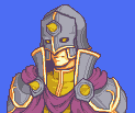
WIP for the Generic Diviner/Justice(Strong/Subboss tier)
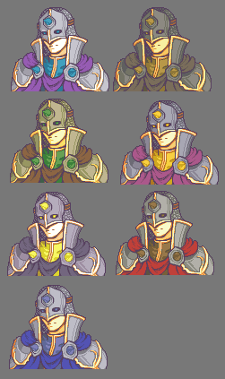
Ilia, Bandit
Sacae, Bern
Etruria, Western
Ostia
There will probably only be Etrurian/Bern/Ostian and possibly Ilian Justice units so the Sacae/Bandit/Western palettes not looking the best don't matter that much for this class :)
Don't know about the glowing eye holes, or the quick attempt at a mail hood, I know parts of the shading need work too ;)
But yeh, main area of concern for me is the helm in general, so I may or may not go with this helm ;)
HAHA According to Nickt, "It's shit, like your[my] face", So yeh, if it is in fact shit... like my face(I actually think I have a pretty cool face but w/e y'know) let me know what to fix :)
-
Pad on our right and the hair shading really bother me, other than that, the thick chestplate trim section seems awfully contrasty, it is much more lakche now though :)
-
Just the thing we decided for generic mugs in fe7x, it sorta blurs their facial characteristics so they're less "people" and more just their class.
Dont know if I posted them here but, Brigand - Berserker Generics I made a while back(Noe fixed up the muscle tone for me and I've since been referencing how he does it so that mine are mo' bettah!)
also

For more comparison, Cavalier Generic base I made(Originally for thief, but yeti wanted a different pose)
Lol the generics I've made so far have similar poses :| I promise I won't use a pose similar to this again on generics haha but 3/20 isn't a big deal.
Cavalier is the Axe mount t1, they're more rough than the fe6/7/8 cavaliers and are more like mounted brigands in armor, so the pose similarity with the brigand ended up being a good thing :)
Merc and Noe have also made Generics with he same eye thing (And I've started a Generic Mage knight mug, though it's not quite ready for public :| *It's UGLEH*, Yeti's also started a Generic Monk, so they're all consistant which is good :D)
-
@ Ecut: Her neck is pretty much the right length, I did an anatomical overlay of it, as did Yeti to double check, but I might tinker with it to see if I can get it better, regarding the colours though, as I have a 15+bkgrnd limit I was forced to use outline colour as one of her armor tones if I wanted her to wear her distinguishing Lipstick, I might darken the lighter purples to have it flow more nicely though.
Thief/Rogue Generic Portrait for FE7X
Weak - Mid - Norm - Strong/Subboss
The Nations colours are shown in the below order:
Ilia
Bandit
Sacae
Bern
Etruria
Western
Ostia
-
-
While it is *under* his pads, it sticks out the same as them/further so it'd catch more light, I might try and mess with it though and see if it looks better darker.

Tinkered with Vaida further, body angle, hood, face a little, and overall positioning.
-
You'd just have to change the format and then you could copy the whole thing in
Name -
If it's like any other forum with polls then it's 1 entry per line, so just save them like that when you edit the first post :D
-
*grumpy face*
I don't want to vote for any Leila mugs cause I don't like them :(
Reaper for Josh mugs, none of the entries are outstandingly clean and her concept was more interesting than most, tough call between her and Nickt, his had a bit more clenliness but not much, it also didnt make much sense in some parts so I went for reapz.
A Loser - for Leila mug, while I don't particularly like it, it was the least bad of the 3(Adressed Nickts shading issues in the entry topic and over IM) Cymbelines is very oddly shaded as well as having an average body shape.
Ecut for both battle sprites, debated with Ken's for Josh for a bit, but Ken's shading is just too stark for me, I much prefer the smoother shading style in FE battlesprites(A lot of yeti's sprites have this, it's also what I try to emulate as I make mundus).
Ecut's Leila smashes the others out of the water, they don't come close in my opinion.
-
Horace update
Re-did a lot of the hair shading, re-angled his breastplate triangle thing, messed with the face and a few other things.
-
It doesn't really make much sense.
The spacing in between everything seems huge(well mostly from is first blur to the end) and makes it look choppy.
I don't know, I am not fond of how he attacks.. It just seems to lack flow. The still is amazing and the sprites are amazingly made but together they just don't flow well.
Ps; I hope I am not being too hard/picky... :P
I think It's partly the positioning, I have it quite wrong as yeti pointed out (He starts further away than he should) SOOO I have to make his first swivel(into the crouch) spin furhter over therefore giving him more room to jump and stuff.
He's also going to take a step forward and slash his 2nd sword(which will be the paused frame during the hit explosion) so it might flow more nicely then i guess?
anyways
More Fe7x - Horace - Etrurian Paladin - Drinking Champion :D
-
I just don't know anymore. ;_;
It's easy enough to check... sausage or taco... et voila :D
-
the timing is probably way off, I'm using unfreeze(which is kinda bad, but it kinda gives you an idea of what it will look like)
I'll probably get yeti to finalize the timing and everything(hopefully shortening down the pre attack sequence flip thing)

Bit of an update, he still needs to hit with his other sword as he turns, but getting close and closer to beign done.
Need to fix the size difference in the landing after the hit frame, he's a little larger than he should be there.
EDIT: woops almost forget "that's yeti's soldier, not mine"
-
minor update, just messing with the blur, im not happy with it yet, it needs to be more dynamic :D maybe have it go up toward his next post rather than be part of it with blur lines attatched.
Will probably re-do the blur and will definately work on this still frame some more too
EDIT:
worked on the blur, much happier now, still might tweak it a tiny bit

-
Yeh, when I eventually finish it, the crit, astra AND the magic sword! hahaha, but yeh this mundus will be in fe7x ;)
-
Yeh, Yeti does most of the battle sprite work, we have rag now on that too(rag mainly makes the in between frames from the main poses)
Then on face sprites, there's Me(probably the most active mugger on the team), Aeo who hasn't been that active though she's got a few mugs in there and some edit work, Merc, more active than Aeo(he's made a fair few mugs, on a few of them i've gone through and style edit his though as they're a tad far from fe, still great sprites though), NOE who's new, contributed a new wallace and a generic pirate set and finally char who's made roeis so far :)
I just felt like something new, and i didn't think mundus fits very well into swordmaster battle sprites.
Lumi's Spritastic Coffeeshop.
in Sprites
Posted
Current Skasha